
Wednesday, August 30, 2006
Tuesday, August 29, 2006
MORE CECIL BELL
 Here's more pictures by my favorite New York City painter, Cecil Bell. I like this woman in green (above). She's sexy, a woman whose whole life is absorbed by the task of appealing to men, but she's also an admirable person in her own way. Bell realizes the value of people like this and paints them.
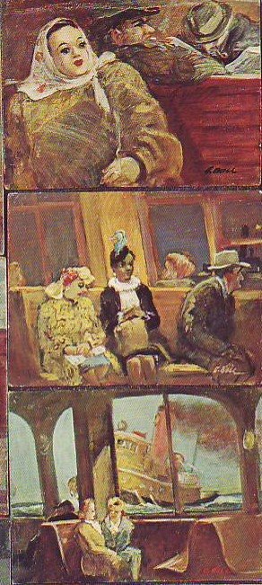 How do you like the picture of the tug and the two chatting women? I could stare at it all day. Two normal, admirable women casually chat next to the technological marvel of the steel structure of the ferry. Behind is the wild, untamed force of the sea and a massive, smoking shape like a giant bullfrog slides past. You can almost smell the sweat, steel and woolen clothing in the ferry interior.
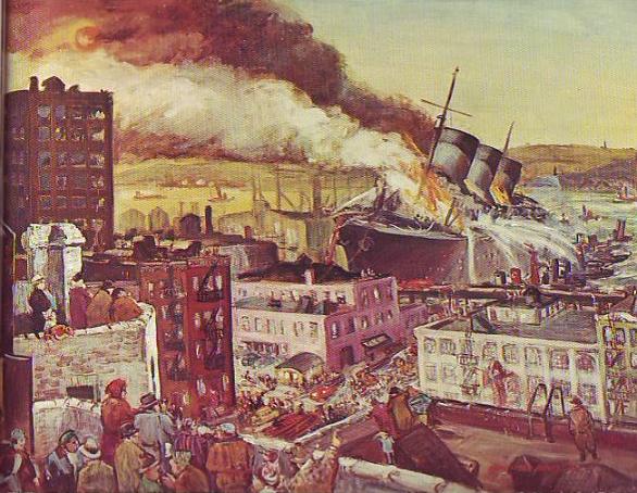
This really happened! It's a scene out of Bosch! A flaming ship out of control smashed through the docks and beached itself on the city street. The people on the roofs, the wild twisting flames, the water canons on the tugs and the wailing of the sirens create an indelible memory.
Monday, August 28, 2006
IS IT WORTH ARGUING WITH CRAZY PEOPLE?
 No, of course it isn't, not if the person is completely crazy, but how often do you come across that? Most crazy people are half crazy or a quarter crazy, something like the way Jack Nicholson was in "As Good as it Gets." How do you treat them? Do you argue back knowing that they may not be listening?
 A further complication is the fact that some half crazy people seem to know the difference in principal between right and wrong. They seem to have a moral sense that can be appealed to. Maybe no one ever does. I don't know of any books or magazines that are written exclusively for the mentally ill. On the other hand they may hear an exceptional amount of moral philosophy from people they irritate, more than the rest of us do. It's hard to generalize; there are so many kinds of crazy. Some of them are nice people, some of them are jerks.
In my opinion it's a good idea to explain why what they're doing is irritating you, even if the explanation would be painfully obvious to any normal person. It may not do any good but you never know. Like I said, there's all kinds of crazy. Maybe at the bottom of the twisted tunnel in their minds somebody's listening.
WHAT DO YOU THINK?
Sunday, August 27, 2006
MINNIE MOUSE'S AMAZING HOUSE
 Two of my favorite spots at Disneyland are Mickey and Minnie's houses. None of the pictures here do them justice. The best parts are beautiful and surprisingly sophisticated.
 The exteriors (one shown above) are amazing for their use of space. The houses seem simultaneously very big and very small. I'm not referring to spaces behind facades but to what you actually see from the street. How did they do that? And look at the garden; the balance of shapes somehow makes it look like all the elements are in motion. The effect is shocking! Are any architects paying attention to this? This is a really interesting idea.
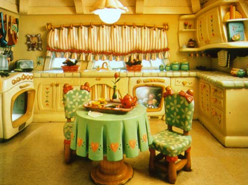 Sadly the picture of the kitchen (above) doesn't capture the dynamic quality of the space. The scale of the objects, the scuptured negative spaces and the magnificently sheltering ceiling are exciting! The only thing that mars it for me is the even spacing of the folds in the tablecloth. I only wish I could have gotten good photos of the living rooms.
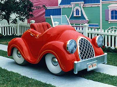 The car outside is amazing! Why aren't there real cars like that? I had to elbow some kids to sit in it but it was worth it. It's even more attractive when seen from the vantage point of the driver inside the car.
A final word about the house: don't misunderstand me. I know that wacky, wonky, skewered lines would grow tiresome if you had to live with them every day. I'm not suggesting that the real world be dismantled to make room for Roger Rabbit-type houses. What I'm saying is that the spatial proportions here are fascinating and would continue to be so even if the lines were straightened out.
Saturday, August 26, 2006
NEWSPAPERS USED TO PUT COMICS ON THE FIRST PAGE!
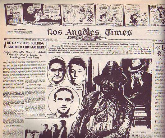 At least the LA Times did on this Sunday in 1931 (above). It's a good-looking page, isn't it? Only an artist could have created a page like this. Newspapers need artists, not just for cartoons but to do page layouts. They just don't know it.
 Compare it to a typical modern page (above). The layout and choice of pictures is uninspired and the color doesn't add anything except cost. I doubt that an artist was consulted.
Normal color photos don't look good in washed-out daily newspaper color. U.S.A. Today was the first daily paper to carry lots of color photography but they were smart. They knew the color news photos sucked so they made a big deal about making a flashy artist-driven weather page with large, solid areas of flat color. Not only that but they put the flashy weather on the back page where every commuter on the train could see it while the owner was reading the side with the bad photos.
 It seems like drawings began to disappear from the first page of the Sunday Times somewhere in the mid-30s. Maybe WWII, with its need for diagrams and maps, brought them back for a while but after that they vanished almost completely. Why? I wish I knew. Anybody care to make a guess?
Friday, August 25, 2006
MAYBE WE SHOULD SNEAK BIAS INTO NEWSPAPER PHOTOGRAPHY
 Don't you think that news photos would be more interesting if they contained an emotional bias? I'll use these old pictures of Betty Davis to make my point. Imagine that a local girl has just won a science fair. Would it be wrong to portray her as slutty (above) with the graphic implication that she slept with someone to get the medal? OK, OK, it would be wrong but surely there's a parallel universe where it would be right. Things are more fun that way.
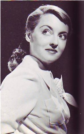 Here's a woman (above) whose husband just died when she took his picture near the edge of the Grand Canyon. Was his fall accidental? The picture lets us know what the photographer thinks.
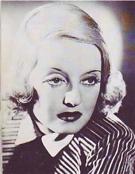
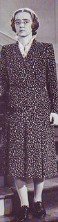
Here (above) are two contestants for a beauty contest. Maybe the photographer has a favorite. What's wrong with that? Newspapers need to be more interesting. We have to figure out a way to make bias work. Maybe we should do biased photo essays recapping the events of a case after the court decides it.
Thursday, August 24, 2006
WRINKLED CLOTHES ARE FUNNY!
 When Phileppe Halsman's "Jump Book" was re-printed in the 1980s I didn't pay much attention. There's a lot of gimmick books out there and this didn't seem to be any different. Now that some time has passed I could kick myself for not buying it. All those wrinkled suits are funny!
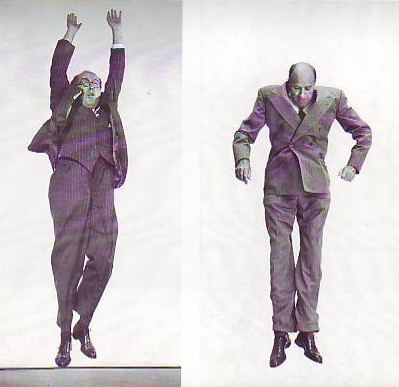 I don't know about you but I LOVE wrinkles..as long as they're somebody else's! It's funny when you see someone who had to dress fast stuck with wearing a shirt that's wrinkled on one side or a jacket with flaps that just won't stay down. Or what about the suit jackets that work their way up as if the wearer had an invisible set of shoulder pads on? Suits have a life of their own. We wear them but we don't own them. We're just their means of locomotion.
 Maybe the all time best suit wrinkles in animation were in the the kissing sequence in "Coal Black." Scribner must have had wrinkled people pose for him. Why aren't there more cartoon scenes like that? Every cartoonist should study wrinkles with the same determination that he studies old stand-bys like male breasts and nose hairs.
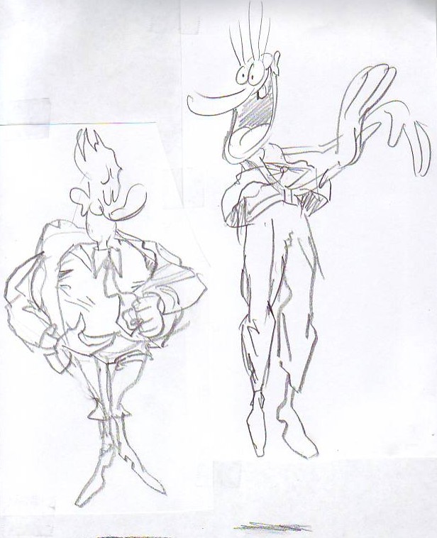 These are terrible sketches but I'll put them up anyway because I got a great idea while drawing them! What if cartoon characters walked around wearing wrinkled clothes? It would at least make a great sequence wouldn't it?...or maybe not. (Groan!) I need to get some sleep.
Wednesday, August 23, 2006
EDITING TOOLS ARE HURTING ANIMATION
 In my opinion recent cartoons are too heavily edited, even when the editing is done by the cartoonist/creator himself. Now that editing is easy and can can be done on a laptop every shot in a cartoon is edited and re-edited til it's considered perfect. That may enhance the filmic quality but it diminishes the sense of preformance and risk. Some cartoons give me a case of "smoothitis."
Easy edits also tend to increase the number of cuts. We all know films that benefited from frequent cuts but I bet I can point to an equal number that were hurt by it. Fred Astaire used to cut his dance scenes as little as possible and it's easy to see why. It's the same reason that magicians on screen resist too many cuts. The audience assumes that the cuts cover up mistakes or chicannery. They think cuts make the performance easier, too easy in fact, and they paid to see somebody do something that's difficult.
 On a related subject, I'll add that quirky motion sometimes adds to the appeal of a scene. Some of the jerky stop-motion on Harryhausen's best scenes (I emphasize the words "some" and "best") actually improved the fantasy. It gave the monsters an unreal, unearthly style of movement that fit the story. Cartoon animation works the same way. Nobody wants jerky animation but we want to see some near misses, some last-minute saves, some cheats that give us an idea of how difficult it is to move this stuff. We want to see a first-rate animator's struggle. Hemingway wrote that nobody can appreciate a good bullfight til they've seen a bad one. That applies to what we do. Let's stop being so slick!
RAY BRADBURY HATES ME!
 It's a strange to think that sci-fi writer Ray Bradbury, the sweetest guy in the worl, a guy who likes just about everybody, can't stand me. I still don't understand exactly what I did. I'll tell you what I know and maybe you can figure it out.
A few years ago I went to hear him speak at a church auditorium near UCLA. It was a few days before Christmas and there were actually snowflakes in the air, a rarity in LA. I was feeling great, not only because of the holiday but because that very day I'd figured out what I thought was the true meaning of Clement Moore's "Night Before Christmas." I told my friends about it but they didn't seem very impressed. It occurred to me that maybe Ray Bradbury would be a more receptive audience.
 Ray's speech was wonderful and afterward he offered to sign books, including books of his that people brought from home. I didn't have a book but I got in line and patiently waited my turn. When I finally got up to him I was almost bursting at the seams. "Ray" I said. "I figured out why "The Night Before Christmas" is the most famous Christmas poem! I can tell it to you in less than a minute!!!"
To my surprise a suddenly grimacing Ray leaned into my face and said something like: "Oh, you're a big man aren't you!? You know more than the rest of us don't you!? You're Mr. Bigshot aren't you!!!??" I was shocked. I could think of nothing else to do but a Ralph Cramden lip quiver: "Humna-humna-humna-humna!" I left the line and felt his stare on my back all the way out the door into the snowflakes.
Did I get him on a bad day? Maybe, but a few weeks ago I went to hear him speak again and he refused to look at me even though I was seated in the front row, right infront of him. There was a long awkward silence when no one could think of a question to ask and even then he wouldn't acknowledge me. He just looked around either side of my (tastefully) waving hand. You'll have to take my word for it that I didn't act in a way that any one else would find off-putting. Maybe I have the wrong pheronomes. Anybody have a thought about this?
Monday, August 21, 2006
MARSHALL VANDRUFF: PIONEERING CARICATURIST
 I used to work with Marshall at Cartoon Network. He's funny, passionate and loves people, qualities which manage to find their way into his caricatures.
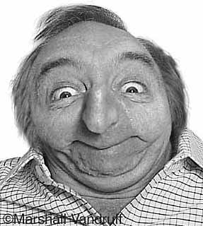 Marshall did caricatures like these in the 80s and early 90s when professional computer caricature was still somewhat uncommon. I think he had to resort to added photographic and prismacolor enhancement to get what he was looking for.
 What a shame that newspapers didn't pick up on what Marshall did...They could have had a Sunday comedy section built around funny pictures like these! As it happened Mad magazine picked up Marshall so it all had a happy ending!
Sunday, August 20, 2006
MAKING A FETISH OUT OF TIMING
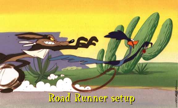 I absolutely love good cartoon timing but I have to admit that I've come to love it less in recent years. I've just seen it abused too often. A lot of cartoon producers and nearly every cartoon writer believes that timing will save an otherwise mediocre cartoon. It won't. It couldn't even save the Coyote and Roadrunner shorts and you're not likely to see better timing than that.
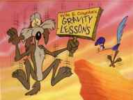 It all goes back to the purpose of cartoons. The purpose of a cartoon is simple: it's to blow the audience's mind. Nobody ever watches a cartoon, or any form of entertainment for that matter, with the intention of seeing something tepid that just passes the time. People want to be transformed and exhilerated. Even after a long day of work when you flop down infront of the TV and your standards are as low as they'll ever be, you'll still find yourself hoping to find a diamond in the rough. Timing isn't capable of delivering a diamond any more than a really good set of tires can drive you to the grocery store. Timing is just timing, something vital that takes its place among other vital things. Good timing plus drek does not a good film make.
 A common story in recent animated features has a bunch of animals run away from captivity to pursue their dreams in some far away haven. How do you blow minds with a story like that? Is the premise intrinsically mind-blowing? No, but you could argue that some classic comedies had plots that were just as thin. Are the characters themselves "great" characters? Probably not. Are the gags strong enough to support the film? Well, maybe they're not THAT strong. It becomes clear when you look at the pre-production art that the backbone of the film, the thing that everyone's hoping will save it, is the timing.
 The thinking is, tighten up the story, the animation and the editing as tight as they can possibly be and all the other problems will go away. But timing wasn't meant to bear that kind of burden. Timing is no substitute for charisma or imagination or street smarts or nobility or fine acting and animation or gut-satisfying humor and story. Timing is just timing.
MY FAVORITE COLOR REFERENCE
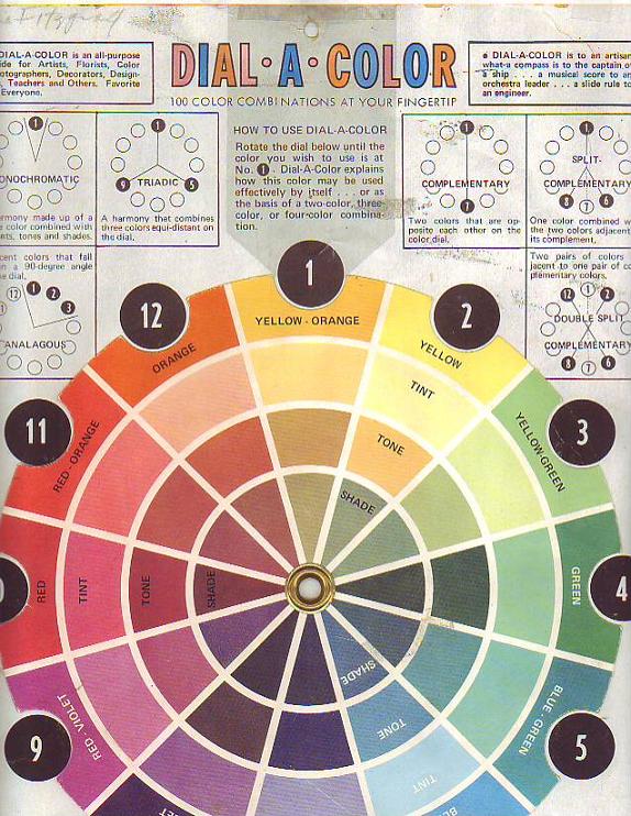 Here's my favorite wheel (above). Sorry for the condition. I bought it in the 80s and it's been stepped on, spilled on, ripped and repaired many times since. It may be out of print now. The copyright name is just an address: Box3193 Amarillo, Texas 79106.
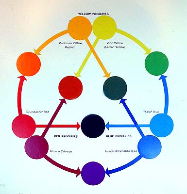 Here's my second favorite (above). It's a reminder that there are warm and cool versions of every color.
 Here's the version (above) currently sold in the art stores in my area. I took off the rotating wheel and use it as a single card.
 Here's the Itten wheel (above): Shades on the outside and tints on the inside. 'Not that useful for what I do but I have it on my wall anyway because it's so beautiful and mysterious! I should put up a Munsell wheel too but I can't find one that I like.
Friday, August 18, 2006
GOOD ACTING IS GOOD READING
 I'm not a professional actor so I'm sticking my neck out on this. I hope the pros will let me know if I don't know what I'm talking about. OK, here goes....
Good live action acting is good reading. Acting is not a branch of psychology or dance, it's a type of music. That's why the most important part of rehearsal is the reading. The actors and the director sit around a table, scripts infront of them, and try to find the rhthym of the dialogue. They're like a jazz combo trying to figure out how they all fit together. Some may come out of the reading with a larger role to play and some will come out with a smaller role to play. Sometimes an extra line or an extra character will be mandated. It's all part of the quest to find the overall "sound."
 When I use the word "reading" I'm not only referring to what happens around the table but also to the literal act of reading itself. Good acting is frequently rhetorical and oratorical, even when it's fairly intimate. Thinking about acting as a sort of heightend speech from a podium prevents an actor from getting too precious and emotionally self-indulgent about a line. It reminds him that his main asset is the quality and control of the voice itself. A good actor knows that how you say something is often even more important than what you say.
ONE OF MY FAVORITE AMERICAN PAINTERS
 You'll have to click on these pictures because the small size doesn't do them justice. Even when enlarged they'll still be too small. There's nothing for it but to buy the book ( out-of-print) : "Cecil C. Bell" by Phyllis Barton.
Bell was a Depression-era "ash can" painter like Reginald Marsh or John Sloane. He clearly loved New York: the El, the ferries, the sidewalk fruit stands.
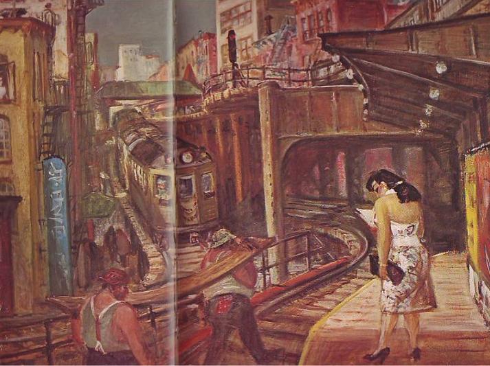 He's also one of America's greatest erotic artists. The sensuality of some of his subjects - always fully clothed and in public - seemed to echo the sensuality of the physical city all around them. He seemed to see the city as a labor of love by the people who built it.
 He was great at mood pieces. It must have been wonderful to go to the city acquarium and take in all the big ugly fish, the institutional green walls and unvarnished wooden floors, the enthusiastic kids and the heroic mothers who tended them
Thursday, August 17, 2006
ARTISTS WHO "OWN" THINGS
 The highest compliment one artist can give another is to say that he "owns" something. In other words, he draws something so well that it's definitive; no other artist is ever likely to draw it as well. In that sense I think most of us would agree that Wally Wood "owns" craters (above) and bullet holes.
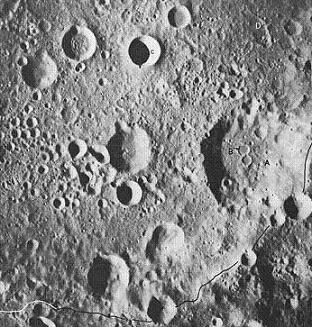 Here's a few real craters (above) for comparison. Wood's craters are better than the real thing!
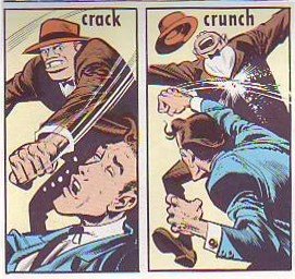 Of course Jack Davis owns knuckles. If you were thinking of competing, forget it. Knuckles are covered!
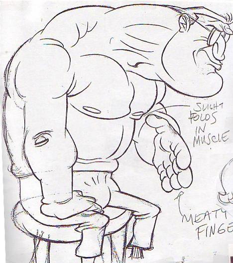 In my opinion John Kricfalisi owns lumoxes. Nobody draws a beefy, intimidating guy better than John. Come to think of it John may own crotches too, I mean crotches of clothed figures. He seems to think it's funny that men have to carry all that plumbing with them, sometimes in tight pants, and everybody who talks to them has to pretend not to notice.
Anybody else care to venture an opinion about who owns what? I believe my daughter may be the world's foremost neck hair specialist. I'll post the drawing the claim is based on as soon as I can find it.
Tuesday, August 15, 2006
LITTLE ANNIE FANNIE LAID BARE
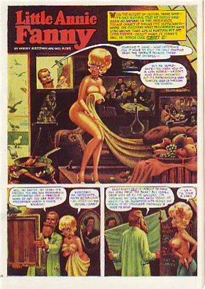 Here's (above) a Little Annie Fannie episode from September 1963. Attributed artists: Kurtzman, Will Elder and Russ Heath. I love the "dipped-in-strong-tea-and-burgundy" color scheme.
  Here's a treat (above): Kurtzman's original watercolor painting of the same page! All the colors we associate with Annie Fannie are here: brown, yellow, orange, red, and green. I think I prefer this rough color scheme to the finished product which mutes the colors to make the word balloons pop better.
Can anyone do a better job than I have at describing the difference between Elder's final color and the Kurtzman rough? I know there's more to it than what I described.
 Here's (above) Kurtzman's original black and white value treatment. The first panel is a whole, self-contained art lesson in how to contrast values for maximum impact. Kurtzman's made me a believer in the idea that you should always take time to do a monochrome value treatment first.
Monday, August 14, 2006
NEWSPAPERS IN 1890 BETTER THAN OUR OWN?
 It's hard to believe but newspapers in the late 1800s were more attractive in one respect than papers are now. The biggest difference is that old newspapers relied mostly on pictures that were drawn.
  An artist can draw a news event, say a murder, in the most exciting way possible. He'll show you the shooter (top picture, above) sneaking up to the victim's home and taking a bead on her. A photographer can't do that. He's stuck with showing up the next day and taking taking a picture of an empty house surrounded by yellow police tape.
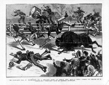
Even televised news is at a disadvantage compared to artist-rendered print media. How would the TV news cover an event like the one shown below where a buffalo went on the rampage? If the cameraman didn't happen to be there all he can do is photograph witnesses talking about it.
We all know that print media is eventually going to lose out to digital media but, given it's magnificent history, it should go down swinging, using every asset at its command. It should tell the news with both art and photography.
BTW, my sources for these pictures, The Police Gazzette and Frank Leslie's ,were weeklies and had a bigger budget for drawings than did dailies of the time.
Sunday, August 13, 2006
THE GREEK TRAGIC HERO AND HOW THE IDEA RELATES TO CARTOONING
 Believe it or not, the Greek concept of tragedy applies to animation and cartooning. By "Greek" I mean the Homeric Greeks. According to historian Warner Yaeger the Greeks thought about tragedy differently than we do. We pity tragic heroes, they admired them.
 The tragic hero led a deliberately unbalanced life. He devoted all his energy into becomming supremely good at one important thing. He may have been a lousy father and an indifferent husband, he may have had no table manners at all, but in his field of expertise he was unbeatable. Of course this skill came at a great price.
The Greeks believed that sooner or later the tragic hero would be brought down by his inability to cope with menace from the part of life that he neglected. They admired the kind of man who took this kind of risk. Modern people admire balance. The Greeks (before Aristotle's time) admired imbalance, though they thought only special people were suited for it.
How does this relate to cartooning? If you have skill and a special passion for it the Greeks say "Go for it! Go all the way and don't look back. " You'll definitely pay the price, but it's worth it.
Subscribe to:
Posts (Atom)